POMPON
Spring 2022 | Branding Identity, Art Direction, Photography
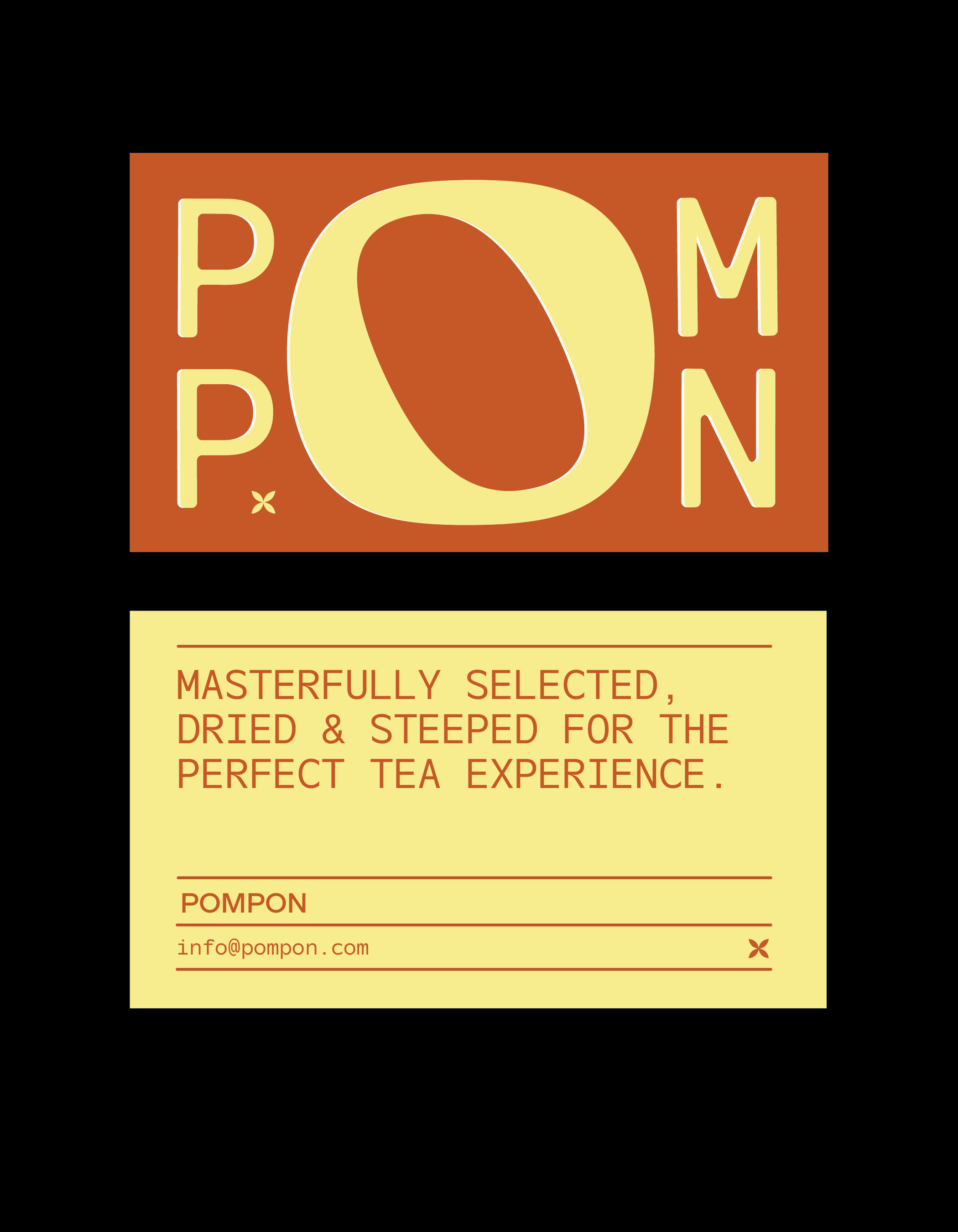
Concept, branding, and art direction for POMPON, an herbal tea company with a modern take on a traditional practice. Inspired by Chinese herbal tea and its medicinal benefits, POMPON imagines a line of drinks dedicated to craft, authenticity, and your wellbeing. POMPOM (a chrysanthemum or dahlia with small rounded flower heads) takes its name from the popping sound created during the heating process to create certain types of tea.
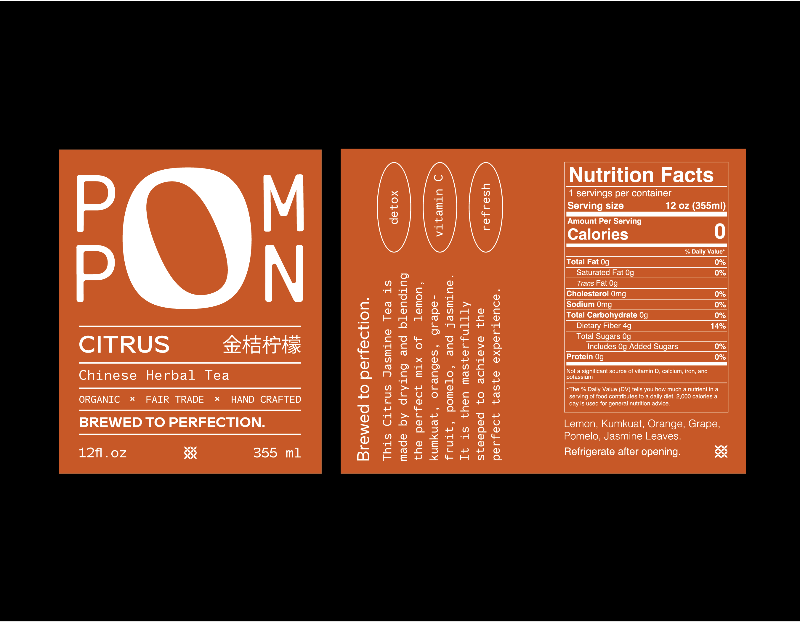
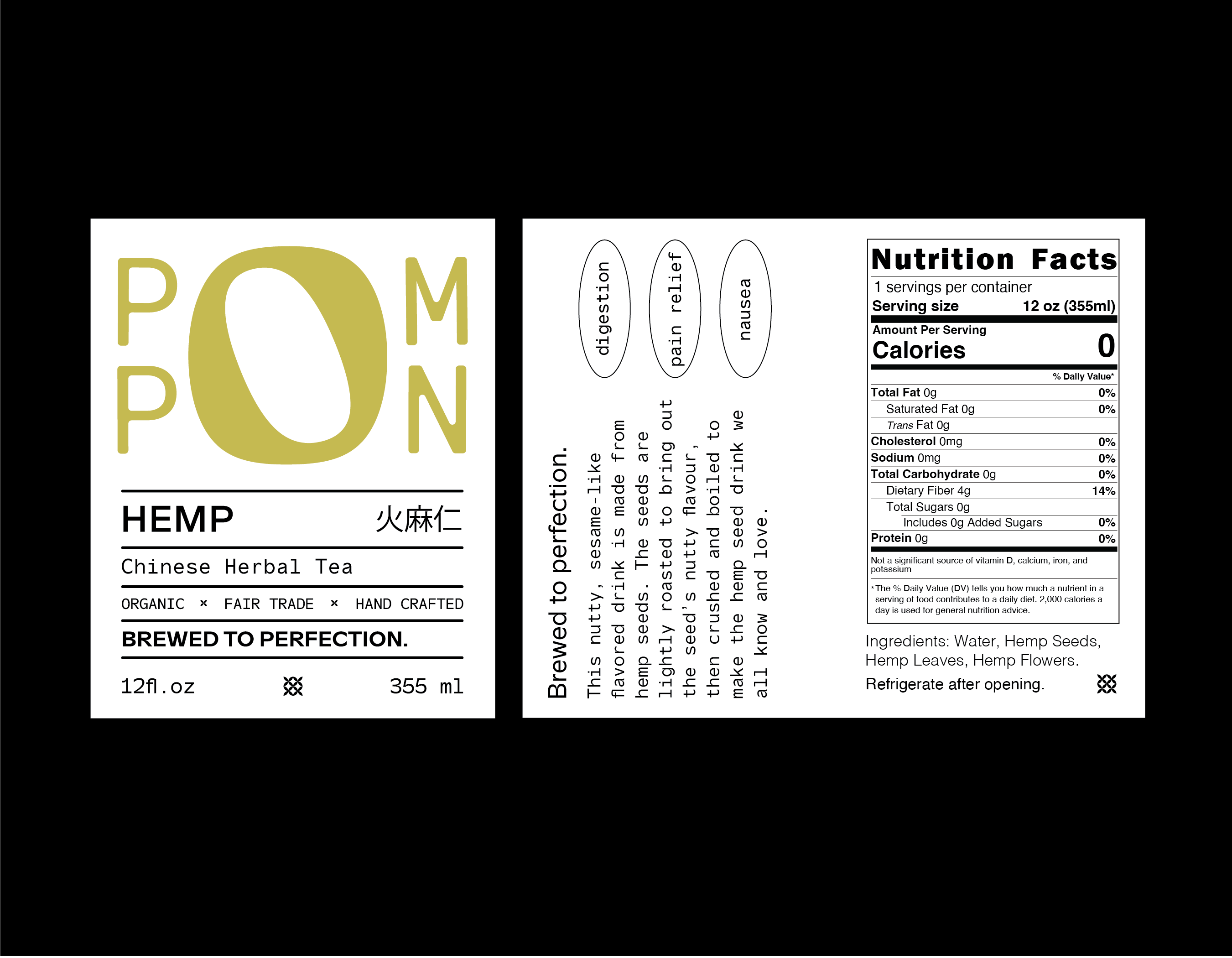
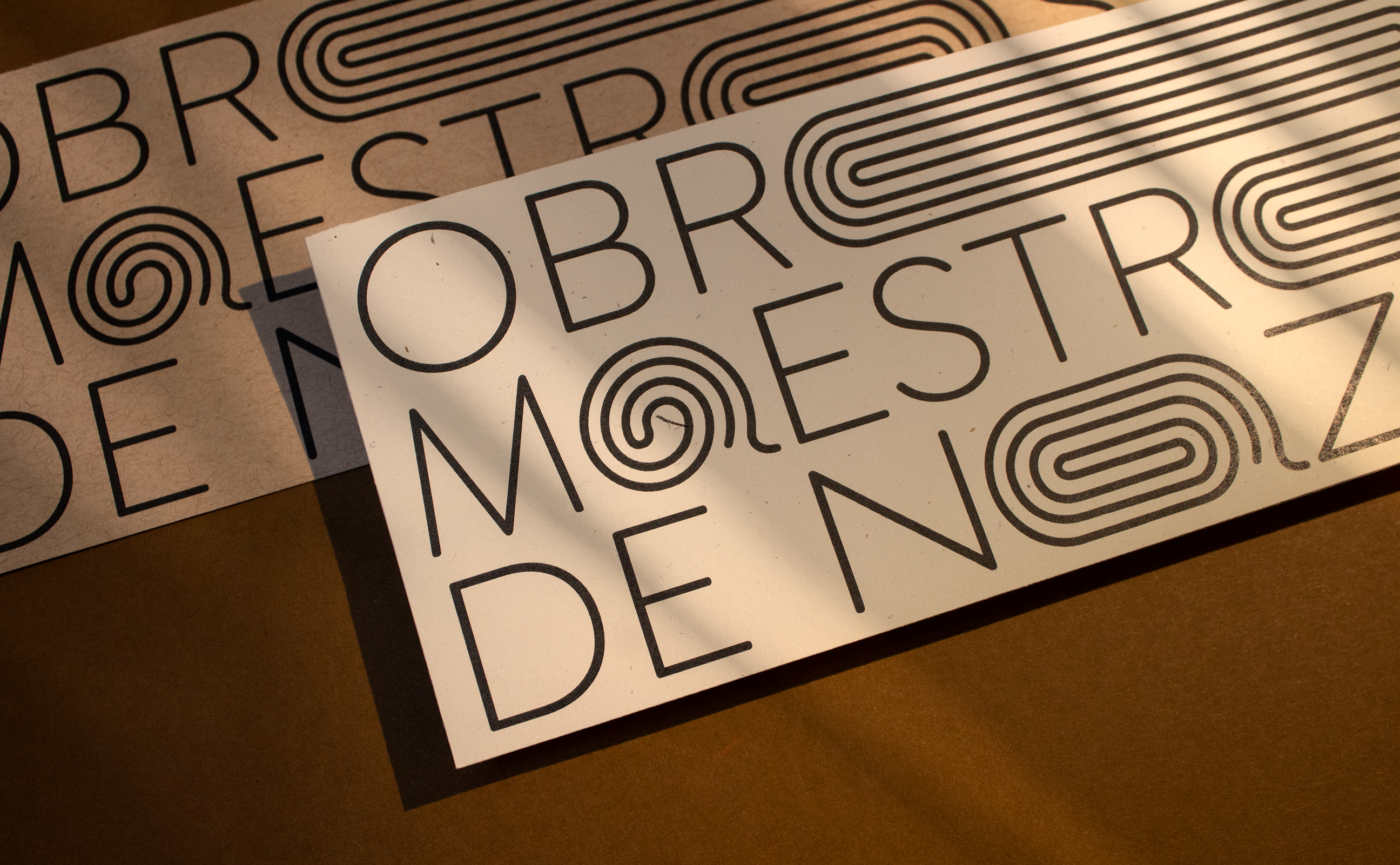
The typography featured on the packaging also takes on an adaptable form. The “O” doubles as a typographic element and a brand element. It takes on the form of various ingredients and can flex to fit any dimension. The design language is inspired by traditional Chinese tea packaging, while the rich colors and lively shapes help modernize the visual system.
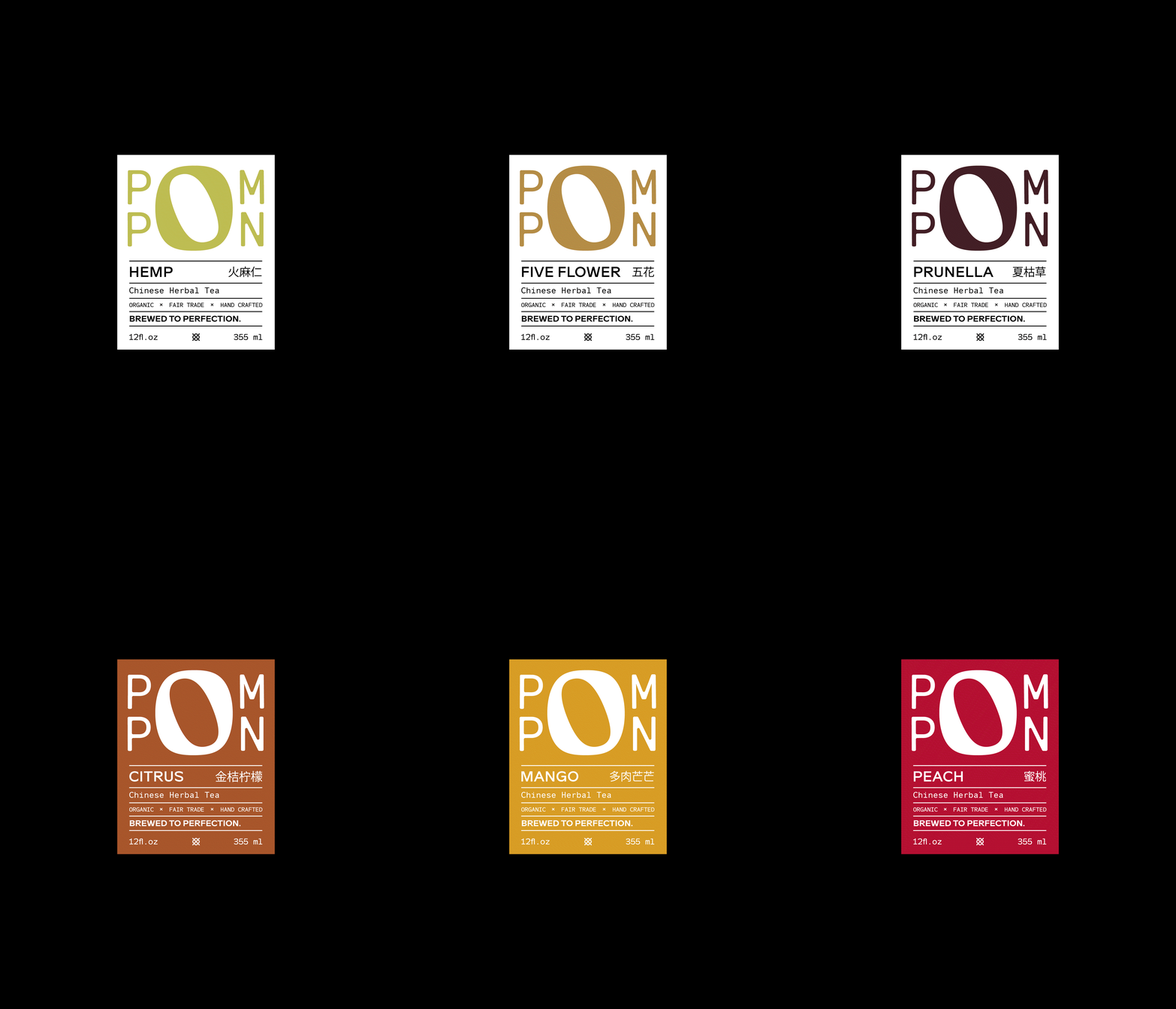
The white cover set is for the line of medicinal teas while the colorful set was created for POMPON’s fruit teas.

